

If you haven't seen THE invitation to THE most talked about wedding in decades- here IT is! Thoughts from any of the common folk out there? We'd love to hear your opinion! Here's ours...
Aside from the astoundingly beautiful insignia at the top- we were, well, royally underwhelmed. The wording is just what we expected- distant, formal, fancy, full of protocol... which is actually quite beguiling. But what strikes us is how impersonal it is... the fill in for the guests name (could they not have left out the fill in the blank lines and just, well, filled it in? And the calligraphy used (not shown) was more than underwhelming as well.
We do, however, love the horizontal orientation, are surprised by the rather abruptness of it all. And, we LUV the reply information all inclusive on the invitation itself. We love that it is assumed that no one could or would (or should!) consider phoning or emailing a reply- letters by post only. Archaic yes- lovely yes!
Needless to say- we have a few selections in our on On Paper invitation arsenal that we thought would have been fit for a Queen and Princess- offering that classic elegance but with a tad more flair.
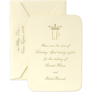
 Martha Stewart for Crane & C0.
 Crane & Co.
  Crane & Co.
BRIDES collection for Checkerboard
 Checkerboard
And this doesn't even touch on the REALLY lovely, far more creative letterpress options we would have loved to see this modern couple toss in to the traditional faire.
Tell us: What would YOUR fairy tale invitation look like???
No comments:
Post a Comment
Don't forget to write!! Let us know your thoughts...